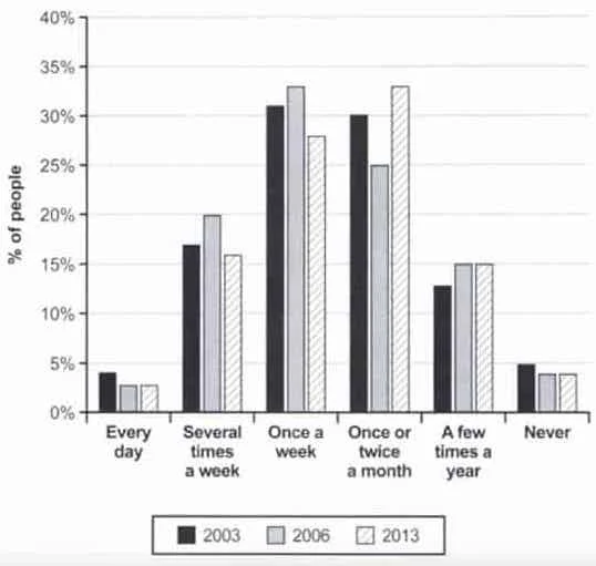
Question – The chart below shows how frequently people in the USA ate in fast food restaurants between 2003 and 2013.
Summarise the information by selecting and reporting the main features, and make comparisons where relevant. Write at least 150 words.

The provided chart offers a glimpse into the changing eating habits of people in the USA in terms of their frequency of visits to fast food restaurants from 2003 to 2013. Over the decade, a discernible trend emerges, reflecting shifts in dietary preferences and lifestyle choices.
In 2003, the majority of individuals frequented fast food establishments once or twice a week, with approximately 40% falling into this category. Meanwhile, a relatively smaller proportion, around 20%, indicated a preference for less frequent visits, limiting their fast food consumption to once or twice a month. Notably, a significant segment, nearly 30%, claimed to avoid fast food entirely.
As the years progressed, a noteworthy transformation unfolded. By 2013, the percentage of those opting for weekly fast food visits surged to approximately 50%, showcasing a substantial increase. Conversely, the proportion of individuals who abstained from fast food entirely dropped to around 20%, indicating a diminishing trend in avoiding fast food establishments.
In summary, the chart illustrates a notable shift in the frequency of fast food consumption in the USA from 2003 to 2013. While the majority of individuals leaned towards weekly indulgence, there was a simultaneous decline in those avoiding fast food altogether. This data provides insights into the evolving eating patterns of the American population over the specified time frame.


